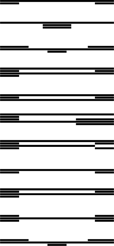
I recently came across a design movement known as “atypography.”
The idea of atypography is to abstract written language to a point that your brain won’t immediately and instinctively read the contents of a message, but rather it takes it for a graphic design element first and foremost and then allows the audience to decide whether or not to spend the time and mental energy to decipher the actual meaning.
This is a great example of our acoustic idea of ambience. The balance of possible effects has been intentionally shifted well to the side of aesthetics (which is a manifestation of mood or tone), which in turn reduces the impact of intelligibility and clarity.
The other effect of this imbalance is that it increases audience agency.
The message is still present, and, if it were a typically legible font, the audience would almost have no choice but to read it because we have become so attuned to the shape of our native alphabet.
However, through the abstraction of atypography, the audience is able to make a conscious decision whether to read or not.
Now, I’m not telling you to start blogging in an unreadable font.
What I am suggesting is that you be intentional about how you select the form of your content to achieve your desired effect, and at the same time think about how the form of your content allows for—or restricts—the options that the audience has to engage with it.